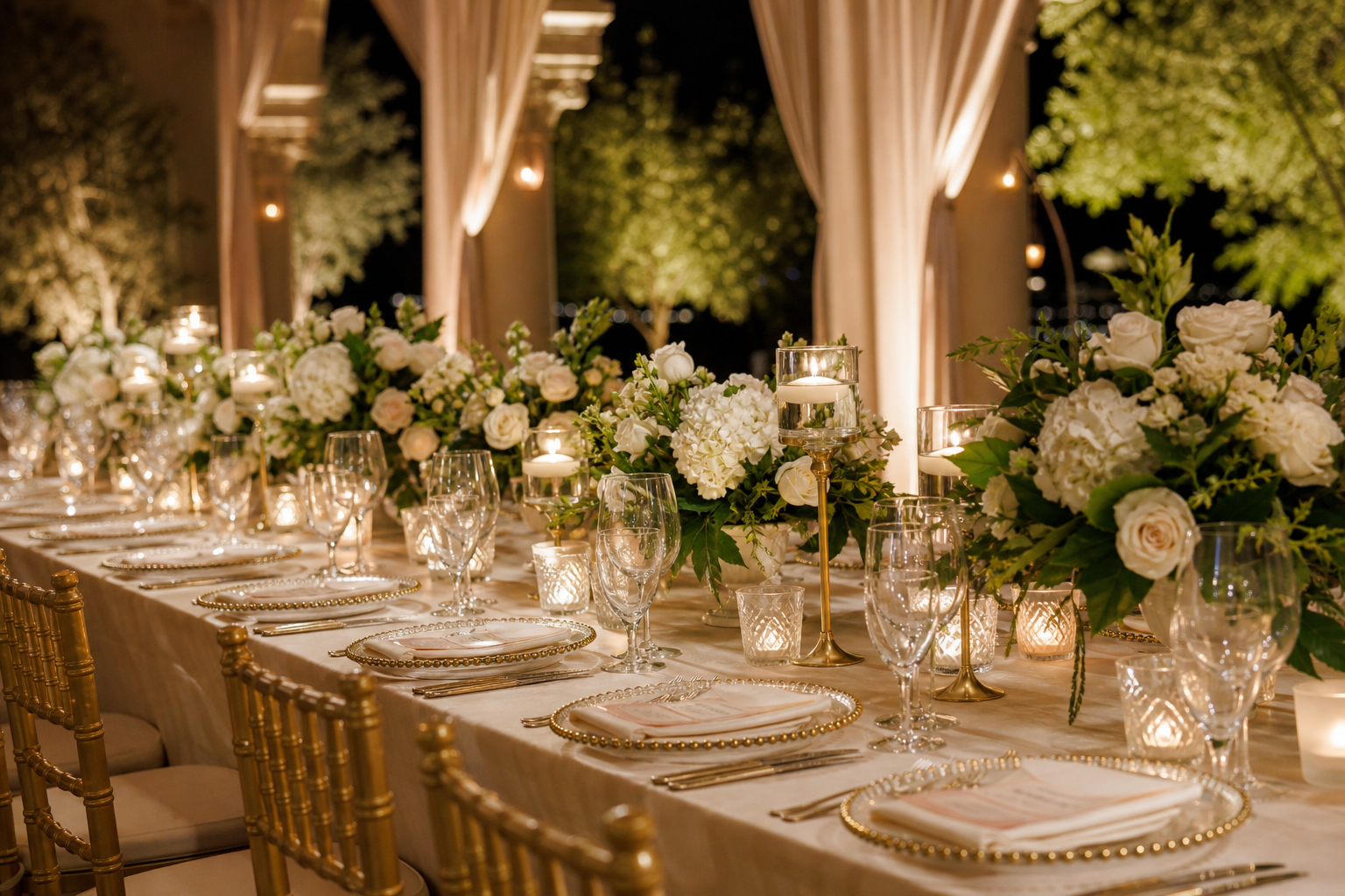
A Practical Guide to Luxury Wedding Tablescape Ideas
Luxury at the wedding table is more than sparkle—it’s intention. A luxurious tablescape feels curated, cohesive, and effortless to guests while reflecting your story in every detail. This guide distills high-impact ideas and practical steps to plan a sophisticated dining setting, whether you’re styling an intimate dinner or a grand reception.
Define your luxury vision
Start with a clear creative direction before choosing any decor. Use these prompts to build a concise vision statement that will guide every choice:
- Adjectives: choose three to five (for example: serene, sculptural, romantic, gilded, modern).
- Inspiration anchor: a material, motif, or heirloom (mother-of-pearl, laurel wreath, lattice, monogram).
- Formality: black-tie, classic formal, modern elegant, or refined casual.
- Palette discipline: 1–2 primary tones + 1 metal + 1 accent neutral.
- Guest experience: warm and candlelit, bright and airy, moody and dramatic, or garden-fresh.
Write your selections in a single sentence, and keep it visible when you evaluate linens, florals, and tabletop rentals to avoid drift.
Palette and materials that signal luxury
Luxury palettes rely on restraint and layered materials. Consider:
- Classic duos: ivory and gold; blush and champagne; charcoal and silver; sage and antique gold.
- Modern depth: stone and black with smoked glass; alabaster and sand with polished nickel.
- High-contrast romance: soft rose with oxblood accents; porcelain white with midnight blue.
Material pairings elevate even simple color stories:
- Linen + lace applique for romance without visual clutter.
- Velvet + brushed metal for winter formality.
- Textured weave + clear glass for a coastal or garden sensibility.
- Marble or onyx chargers + crisp hemstitch napkins for tailored minimalism.
Build the foundation: linens, runners, and chargers
Think of the tablecloth as your canvas. Quality foundations create a quietly opulent backdrop so every layer reads as intentional.
- Tablecloth: opt for heavy-weight fabrics with a graceful drop; press and steam for a flawless line.
- Overlay or runner: introduce pattern or metallic thread sparingly to avoid competing with florals.
- Chargers: the most impactful small spend—lacquer, mother-of-pearl, hammered metal, or stone grounds the setting and frames each course.
- Napkins: elevate with luxe textures (linen, velvet, satin) and finished edges (rolled hem, mitered corners).
Centerpieces that breathe luxury
Luxurious centerpieces balance presence with conversation comfort and service practicality.
- Scale and proportion: mix low lush arrangements with a few tall sculptural pieces to create a skyline without blocking sightlines.
- Vessel selection: footed bowls, compotes, low troughs, or modern ceramic cylinders keep stems neat and intentional.
- Negative space: leave breathing room between pieces so the table doesn’t feel crowded; luxury is often what you edit out.
- Non-floral luxury: incorporate fruit still lifes, stone objects, porcelain figures, or clustered sculptural leaves for dimension.
- Scent control: prioritize lightly scented blooms to avoid competing with cuisine.
Light the table like a scene
Candlelight is the single fastest route to a luxe mood. Combine sources for depth and reflection:
- Layered heights: taper candles in crystal or metal holders, low votives for sparkle, and a few hurricanes to stabilize flame near florals.
- Reflective accents: mirror tiles or polished charger rims amplify glow without adding new colors.
- Safety and spacing: ensure flame clearance from greenery; stagger placements to allow servers clear access.
If open flame isn’t permitted, mix high-quality LED tapers with frosted votives and keep color temperature warm for authenticity.
Place setting mastery: glassware, flatware, and china
Anatomy of a refined setting:
- Base: charger, dinner plate, salad/appetizer plate as service requires.
- Cutlery: align edges precisely; consider mixed-metal only if repeated elsewhere (for example, gold flatware with silver-edged china requires a unifying metal in decor).
- Glassware: a trio feels luxe—water goblet, wine glass, and champagne flute or coupe. Smoked, colored, or cut-crystal glassware adds dimension.
- Napkin treatment: crisp fold with a place card, loose knot for relaxed luxury, or a ribbon with a wax-seal tag.
Keep the arc of glassware outside the service path and align stems for a disciplined look.
Paper and personalisation
Stationery and small keepsakes bring focus to individual seats while reinforcing your design language.
- Menus: debossing, letterpress, foil details, or vellum overlays feel elevated; echo your primary motif or monogram.
- Place cards: tented cards in heavy stock, acrylic discs, or miniature tags tied with silk ribbon.
- Escort display: mirror calligraphy, stone tiles, or botanical pins for a tactile first impression before guests arrive at the table.
- Favors at the setting: minimal, purposeful items—artisan chocolates, a tiny bottle of infused oil, or a pressed-flower bookmark.
Texture, height, and balance
Luxury often comes from how surfaces play together:
- Mix soft and hard: velvet runners with crystal; linen with polished metal; matte ceramics with glossy glass.
- Vary heights: alternate low florals with medium candleholders; keep tallest pieces off-center so conversations remain open.
- Repeat motifs: a laurel leaf on the menu, napkin ring, and cake stand ties the room together without excess decor.
Chairs and the 360° view
Guests interact with the table from all angles—chairs are part of the tableau.
- Chair style: choose silhouettes that echo your theme (Louis for classic, cane-backed for garden, ghost for modern minimalism).
- Dressings: soft drapes, single-stem adornments, or sleek bands. Reserve more elaborate decor for head table or sweethearts.
- Consistency: if chair covers are necessary, prioritize tailored fit and wrinkle-free finish.
Layouts that work: rounds, banquets, and hybrids
Layout influences how luxury reads in the room.
- Round tables: ideal for symmetrical centerpieces and conversational clusters; keep diameter in mind so center detail remains visible.
- Banquet/feasting tables: dramatic runs with repeated elements (evenly spaced compotes, candle trios, and bud vases) to create rhythm.
- Hybrid plans: alternate rounds and long tables to maximize space and visual interest; maintain a single color/material language across both.
Service style and flow
Your catering format affects what fits on the table and where luxury shines.
- Plated: allows fuller decor footprint—chargers may remain through main, and low florals can be denser.
- Family-style: edit decor to leave room for platters; choose narrow-footed vessels and elevated candleholders to free surface area.
- Buffet: tables can host sculptural centerpieces since plates aren’t refreshed as often; ensure candles do not obstruct water service.
The high-impact edit: where to invest attention
To achieve a luxe feel efficiently, focus on elements guests notice most up close:
- Chargers and napkins: the first tactile touchpoints.
- Candlelight: perceived as intimate and high-end.
- Consistent glassware: uniform silhouettes read as polished.
- Pressed linens: instantly lifts the entire room.
- Menu and place card duet: sets a refined tone at every seat.
Three signature looks to adapt
Use these modular concepts as starting points. Swap colors or materials while keeping the overall structure.
-
Modern Sculptural
- Palette: alabaster, graphite, polished nickel.
- Foundation: matte stone chargers, crisp white cloth, narrow velvet runner.
- Centerpieces: asymmetric branches, minimal blooms, smoked glass cylinders.
- Accents: folded napkins with metal menu clip, linear candleholders at varied heights.
-
Romantic Gilded
- Palette: blush, ivory, antique gold.
- Foundation: soft textured linen, lace-edged runner, gold-rim chargers.
- Centerpieces: low compotes with garden roses and airy greenery.
- Accents: taper candles in gilded holders, letterpress menus with foil monogram.
-
Garden Grandeur
- Palette: sage, stone, clear crystal.
- Foundation: natural linen, hemstitch napkins, glass chargers.
- Centerpieces: layered herbs, seasonal blooms, and fruit still lifes.
- Accents: mix of hurricanes and votives, hand-tied place cards with silk ribbon.
Sustainability and practicality
Luxury and responsibility can align beautifully with thoughtful choices:
- Choose reusable baseware (chargers, candleholders) and rent high-quality linens over disposables.
- Source seasonal florals; design low-and-lush arrangements that can be gifted post-event.
- Opt for soy or beeswax candles with cotton wicks for cleaner burn and stable flame.
- Design multi-use stationery: a combined menu/place card reduces paper while feeling intentional.
Timeline and checklists
Working sequence helps you maintain precision without stress. Use this sample timeline as a guide leading up to the event:
- 12–16 weeks: lock the creative direction; shortlist linens, chargers, glassware, and centerpiece styles.
- 8–10 weeks: confirm rentals and quantities; finalize florist brief with stem types and color references.
- 6 weeks: approve menu and stationery design; map table layout and centerpiece spacing.
- 2–3 weeks: conduct a tablescape mockup with at least one full place setting and centerpiece.
- Event week: inventory count, steaming/pressing schedule, candle and lighting plan, labeling for each table.
- Event day: linen install, centerpiece placement, candle distribution, final alignment of cutlery and glassware, and a low-light check.
Quick packing list for setup crew:
- Steamer, lint rollers, microfiber cloths, and wrinkle-release spray.
- Measuring tape and laser level for runner centering and spacing.
- Safety kit: floral clippers, zip ties, museum putty for candleholders, matches/lighters.
- Printouts: table map with centerpiece counts, place card alpha list, and lighting diagram.
Common pitfalls to avoid
- Overcrowding: leave space for bread, water, and service clearance; edit accessories ruthlessly.
- Competing textures: limit high-shine surfaces so reflections don’t feel chaotic.
- Inconsistent metals: mix only with intention and repetition; otherwise, pick one.
- Unplanned candle smoke/heat: protect florals with hurricanes and mind overhead installations.
- Ignored sightlines: test seated views across the table and to focal points like the head table.
Luxury on any guest count
Scale design principles rather than budget. For larger dinners, repeat a concise set of elements for rhythm; for intimate gatherings, upgrade touchpoints at every seat. Consistency, candlelight, pressed linens, and disciplined color are the universal levers.
FAQs
How do I choose a tablescape palette that won’t date quickly?
Build around timeless neutrals (ivory, stone, charcoal) and add a restrained accent from your floral story or attire. Keep metals consistent and introduce trend-forward elements in easily swappable items like napkin treatments or menu finishes.
What’s the ideal height for centerpieces to keep conversations comfortable?
Use a mix: low pieces under eye level for most seats and tall designs that start above eye level with clear stems or slim profiles. Always test two guests seated directly across to confirm unobstructed views.
Can family-style dining still look luxurious?
Yes—prioritize narrow-footed vessels, elevated candleholders, and edited decor clusters. Keep the runner clean, create evenly spaced decor intervals, and maintain a cohesive material language across serving platters.
Do I need chargers for every setting?
Not strictly, but chargers frame the plate and signal formality. If you’re selective, prioritize head tables and visible areas while keeping other settings consistent with great linens, aligned cutlery, and refined napkin treatments.
How many candle types should I mix?
Two to three is sufficient: for example, tapers, low votives, and a few hurricanes. Keep holders within one metal or complementary finishes and stagger heights for dimension.