Corporate event styling ideas are the design choices that shape the look, feel, and flow of conferences, product launches, and galas. Done well, styling turns goals into experiences through color, layout, lighting, and decor. Based in HA3 0PB at Abercorn Garden, Patel Events applies these principles to elevate Greater London business events end to end.
By Shani Patel — Patel Events | Last updated: May 13, 2026
Quick Summary
Corporate event styling blends brand identity with guest experience. Focus on five pillars: purpose, palette, lighting, layout, and storytelling. Use a 60-30-10 color rule, 3000–3500K warm-white lighting for dinners, clear sightlines, and multi-sensory moments. Build a 90-day plan with milestones for approvals, mockups, and vendor holds.
Use this guide to plan or refine styling for your next conference, product launch, or annual gala. You’ll find definitions, strategy, step-by-step workflows, 13+ styling ideas, toolkits, and London-specific tips. Throughout, we share hands-on practices Patel Events uses across Corporate Events, Annual Galas, and Destination showcases.
- What corporate event styling really is—and isn’t
- How to translate brand identity into tangible design
- Proven layouts, lighting looks, and tablescapes
- Inclusive, sustainable, and tech-forward choices
- Case examples from London and beyond
What Is Corporate Event Styling?
Corporate event styling is the intentional design of visuals, ambiance, and guest flow to express a brand’s objectives. It combines palette, materials, staging, lighting, florals, and spatial planning to shape emotions and behavior. The output is a coherent, on-message environment that guides attendees from arrival to encore.
Styling is not random pretty decor. It is a strategic design system that supports business goals—whether that’s product education, executive visibility, partner networking, or employee celebration. When the styling works, attendees intuit where to go, when to pay attention, and how to engage.
- Inputs: brand standards, audience needs, venue constraints, program agenda.
- Levers: color and texture, lighting temperature, sightlines, acoustics, tablescapes, signage placement, and interactive zones.
- Outcomes: higher dwell time, stronger recall, smoother transitions, and a consistent photo story for post-event content.
In our experience designing annual galas and leadership summits, coherence wins over complexity. A tight palette (60-30-10 ratio), two signature materials, and a focused lighting plot often outperform maximal setups with competing elements.
Why Styling Matters for Business Outcomes
Styling matters because design drives behavior. Clear layouts improve circulation, lighting directs focus, and tactile details anchor memory. The right choices elevate keynote moments, support networking, and produce consistent visuals for PR, social, and internal communications.
Here’s why this is crucial for corporate teams:
- Attention control: Stage washes at 400–600 lux with a contrasting room ambiance keep eyes on speakers.
- Wayfinding: 6–8 foot pathways reduce bottlenecks and improve time-on-task for activations.
- Memory anchors: Distinct textures (matte vs. gloss), temperature shifts (warm for dinners, neutral for breakouts), and signature scents create recall.
- Photo consistency: A unified color story raises the usable-photo yield for comms teams.
- Accessibility: High-contrast edges, glare control, and 32-inch minimum clear widths support inclusive design.
When we style leadership dinners, we aim for 3000–3200K on table surfaces to flatter skin tones and menu photography, with practicals (candles or LED housings) every 24–30 inches to even out spill. That balance elevates the mood while maintaining legibility for conversation and note-taking.
How Corporate Styling Works: Step-by-Step
Translate business goals into design with a clear workflow: discovery, concept, prototyping, procurement, preproduction, show day, and debrief. Lock the palette and lighting early, mock key touchpoints at 1:1 scale, and leave 15–20% flexibility for venue realities and sponsor integrations.
Discovery and Alignment (Days 1–10)
- Purpose: Define a single sentence (“Celebrate sales excellence and strengthen partner ties”).
- Audience: Map personas and constraints (mobility, sensory needs, travel fatigue).
- Success metrics: Target tangible outcomes (briefing completion, demo participation, sentiment shift).
Concept and Narrative (Days 11–25)
- Design boards: 2–3 distinct directions with palettes, materials, and lighting references.
- Story spine: Arrival cue → keynote reveal → breakout rhythm → dinner ambiance → finale.
- Signatures: One hero moment (e.g., kinetic lighting reveal) and one tactile motif (e.g., ribbed glass + velvet).
Prototype and Test (Days 26–40)
- 1:1 mockups: Stage lectern sightline, centerpiece height (≤14 inches for sightlines), and linen textures.
- Lighting pre-viz: Plot 3000–3500K options for dining, 4000K for showcases, dimming curves at 5% increments.
- Flow: Tape layouts to scale; test 6–8 foot aisle comfort with 200–300 guests in mind.
Procurement and Vendor Holds (Days 41–60)
- Lock suppliers: Florals, rentals, scenic, lighting, AV, and lounge furniture.
- Material samples: Approve swatches under event-intent lighting temperature.
- Buffer: Carry alternates for any element with >10-day lead time.
Preproduction and Rehearsals (Days 61–85)
- Run of show: Cue-to-cue with lighting looks named and timed.
- Staging: Check ADA-equivalent ramp angles at ≤1:12 rise and non-glare surfaces.
- Rigging: Verify trim heights and no-sightline obstructions over 7 feet.
Show Day and Debrief (Days 86–90)
- Early access: 2–3 hours buffer for styling finesse and chair lines.
- Pulse checks: 15-minute holds for sponsor swaps and lectern polish.
- Post: Photo selects within 48 hours; 30-minute debrief on what to optimize.
13+ Corporate Event Styling Ideas That Work
Anchor your design with a tight palette, layered lighting, and tactile materials. Then add one hero feature per zone—a reveal wall, kinetic light look, or living greenery moment. Keep centerpieces under 14 inches for sightlines, designate 6–8 foot aisles, and add comfort-driven lounge vignettes every 30–40 guests.
Staging and Sightlines
- Floating stages with integrated LED edge glow (no glare) to separate speakers from background clutter.
- Asymmetrical scenic using ribbed glass and matte black truss to frame keynotes without blocking IMAG.
- Lectern alternatives: low-profile confidence monitor + countryman lav to free body language.
Lighting Looks
- Layered plot: 3 zones—stage key at 400–600 lux, room ambiance at 100–150 lux, accents at 200–300 lux.
- Color temperature: 3000–3200K for dinners; 3500–4000K for demos; keep CRI ≥90 for true product color.
- Dynamic moments: 12–20 second crossfades to shift energy between program segments.
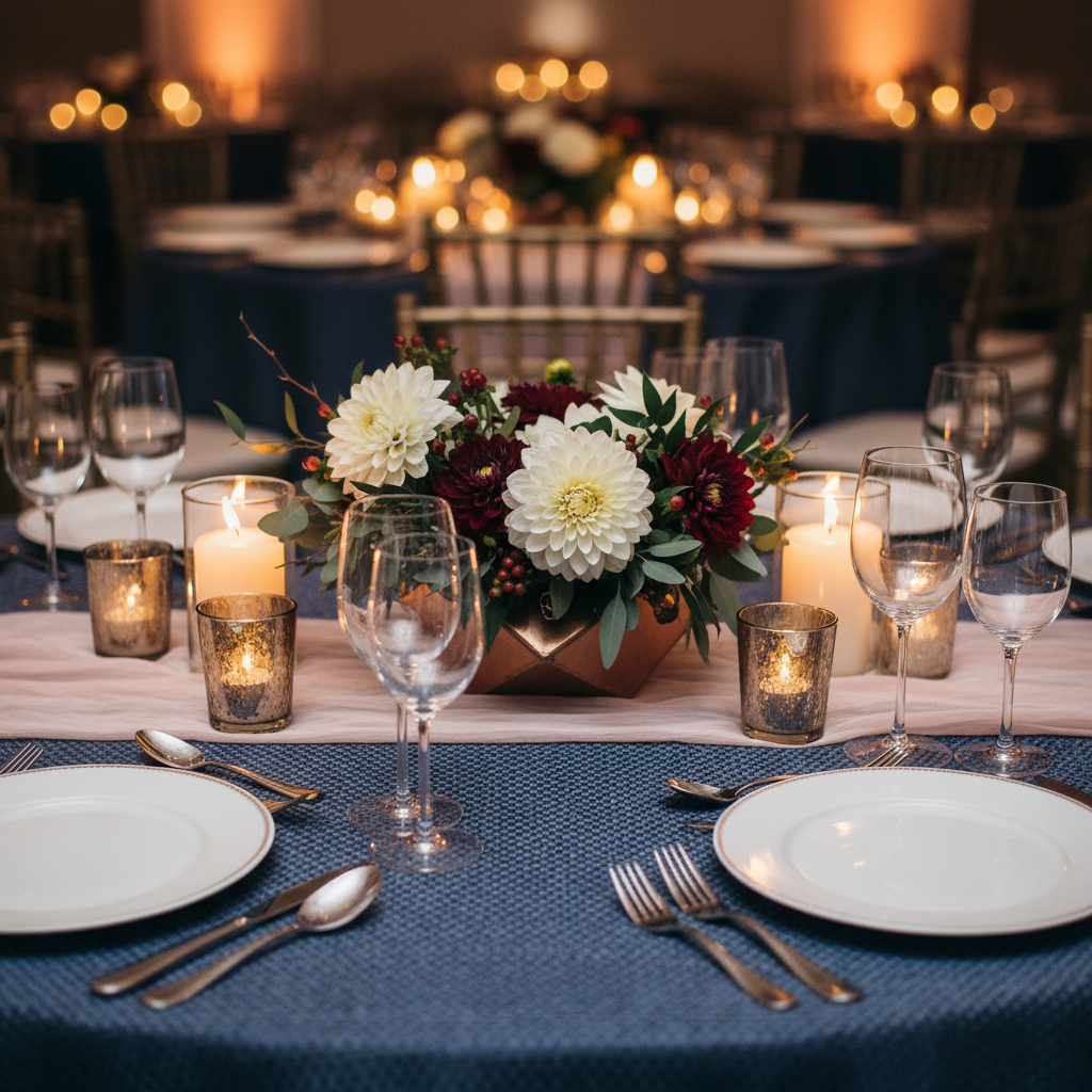
Tablescapes and Centerpieces
- Low-profile florals (≤14 inches) with seasonal stems and textural greens so guests see across tables.
- Runner textures: alternate velvet and woven linen for tactile variety; place candles every 24–30 inches.
- Number markers: geometric objects in brand colors so navigation is visual, not text-dependent.
Arrival and Registration
- Split arrivals: Dedicated VIP drop and standard entry prevent congestion; both share the same palette.
- Photo-forward moment: A living greenery wall with dimensional shapes for depth at 85–95 inches height.
- Lighting cue: 10–15% brighter than the main room to keep check-in brisk.
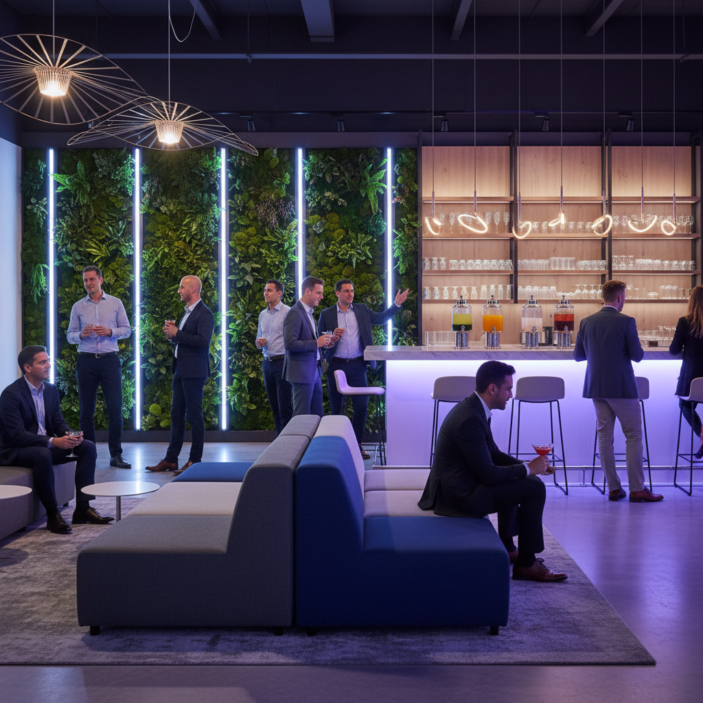
Networking Lounges
- Zone mix: 60% soft seating, 40% high-tops; one power station per 10–12 guests.
- Acoustic control: Rugs or felt panels reduce RT60 reverb and keep speech clear.
- Greenery: Planters every 8–10 feet to organize flow without hard barriers.
Brand Touchpoints (Subtle, Not Shouty)
- Signature color gradients in lighting or drape panels to imply identity without over-branding.
- Material cues drawn from product design—e.g., brushed metal, ribbed glass, recyclable acrylic.
- Interactive plinths with low-glare tops for product demos and small-group storytelling.
Food and Beverage Styling
- Service geometry: U-shaped stations speed access; add task lighting at 200–300 lux.
- Color harmony between menu items and linens so plating photographs naturally.
- Circulation: 6–8 foot returns on buffets; water stations every 25–30 guests.
Sustainable and Reusable Elements
- Modular scenic that repurposes across events; select recyclable substrates and low-VOC finishes.
- LED-only plots with dimmable drivers; program energy-efficient cues.
- Floral reuse plan: relocate arrangements from plenary to dinner; donate post-show.
Inclusive Design
- High-contrast edges on stage stairs; non-slip nosing strips; ramps at ≤1:12 slope.
- Quiet zone seating near exits; soft lighting and acoustic treatment.
- Textures over text: rely on shape, color, and lighting as navigational cues.
Tools, Checklists, and Resources
Use a shared mood board, a lighting lookbook, and a floor plan kit to align stakeholders fast. Standardize on a 60-30-10 palette sheet, centerpiece height guide, and aisle-width spec. Keep a show-file that lists cues, lux targets, temperatures, and trim heights in one place.
- Styling brief template: Purpose, audience, non-negotiables, palette candidates, material list, lighting temperatures.
- Floor plan toolkit: Pre-sized 60-inch rounds, 30-inch high-tops, 8-foot hedges, 6–8 foot aisles, and ADA-equivalent ramps.
- Lighting lookbook: Dinners at 3000–3200K; demos at 3500–4000K; crossfades in 12–20 seconds.
- Centerpiece guide: ≤14 inches for plenary and dinners; ≤9 inches for tight conference rooms.
- Show file: Cue list, console notes, calling script with snap, fade, and black timings.
For principles on decoration and lighting, see concise primers on venue transformation ideas and professional lighting design. For program readiness, a corporate event checklist helps teams align logistics with styling.
Case Examples from Patel Events
We translate briefs into experiences across London and destination venues. Common threads: disciplined palettes, layered light, and purposeful flow. Below are three snapshots showing how small technical choices—centerpiece height, temperature, aisle width—deliver outsized guest comfort and stronger photos.
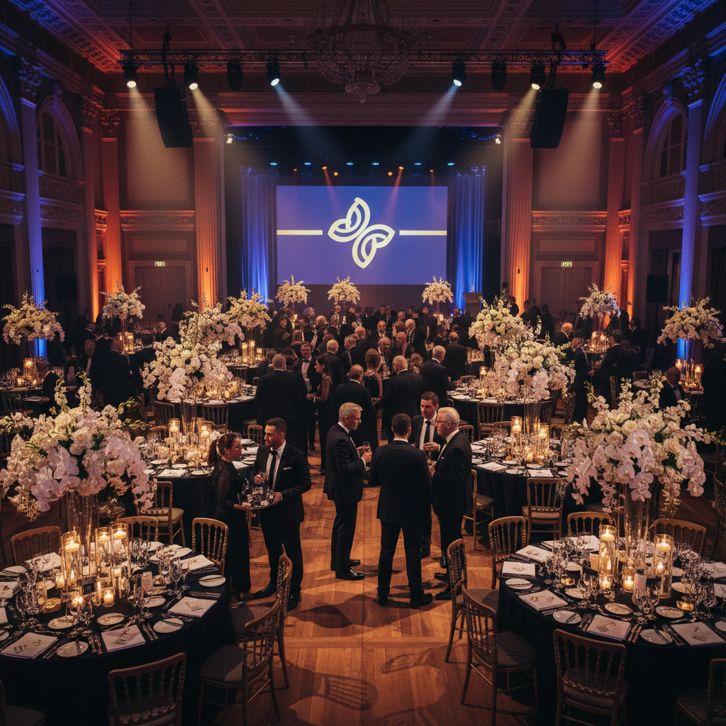
Annual Gala in Greater London
- Objective: Celebrate partner achievements and unveil a CSR initiative.
- Styling: Navy, champagne, and forest-green (60-30-10); ribbed glass scenic; 3100K table pools.
- Flow: 8-foot aisles; soft seating nooks every 30–40 guests; living greenery arrivals wall at 90 inches.
- Result: Guests navigated easily, and the photo set yielded consistent, on-brand tones for the press kit.
Product Launch with Hands-On Demos
- Objective: Hands-on engagement with a new device family.
- Styling: Neutral 3800–4000K in demo bays, CRI ≥90; non-glare plinths; matte black cable management.
- Flow: One-way loop with 6–8 foot corridors; wayfinding through color shifts instead of text signs.
- Result: Shorter queue times and high dwell-time at hero stations; clean product color in photos.
Leadership Dinner (Harrow)
- Objective: Intimate conversation between executives and advisors.
- Styling: 3000–3200K tables; candles at 24–30 inch intervals; low-profile florals at 12–14 inches.
- Flow: 6-foot access lanes for service; discreet backdrop for press photos.
- Result: Warm, legible tablescapes and crisp headshots; effortless service without guest disruption.
Corporate Styling in Greater London: Local Context
In Greater London, venues vary from historic halls to modern conference centers. Style for mixed lighting conditions, transport access, and late-evening energy. In HA3 0PB, plan arrivals around transit and optimize wayfinding for multi-level spaces to keep guests moving and engaged.
Patel Events is rooted in Harrow and serves the wider UK. We design conferences, launches, and annual galas to match brand goals and guest expectations—balancing global polish with local flow. Neighborhood-level planning matters: the difference between smooth entry and a stressed lobby is often a 10-minute arrival window and a clearly lit path.
Local considerations for HA3 0PB
- Time arrivals to off-peak transit near Preston Road Station when feasible; split VIP and general guest entries.
- Winter evenings need warmer ambiance (3000–3200K) to counter early dusk; use brighter arrival bays for confidence.
- Multi-level venues benefit from color-coded lighting cues per floor so navigation isn’t text-dependent.
Planning Matrix: Where Each Element Performs Best
Choose elements based on outcomes, not trends. Warm whites flatter dinners, neutral whites suit demos, and bold accent colors energize reveals. Low florals preserve sightlines, asymmetrical scenic frames content, and 6–8 foot aisles prevent pinch points during transitions and service.
| Element | Best For | Specs/Numbers | Why It Works |
|---|---|---|---|
| Table Lighting | Dinners, receptions | 3000–3200K, 100–150 lux | Flattering skin tones, legible menus, warm ambiance |
| Demo Lighting | Product zones | 3500–4000K, CRI ≥90 | True color rendering, crisp edges, photo-friendly |
| Centerpieces | Plenary/dinners | ≤14 inch height | Maintains sightlines and table conversation |
| Aisle Width | All formats | 6–8 feet | Reduces bottlenecks and eases service |
| Color Strategy | Entire event | 60-30-10 rule | Visual coherence and brand clarity |
| Arrivals Wall | Photo moments | 85–95 inch height | Creates depth and consistent framing |
Best Practices We Rely On
Focus on fewer, better elements. Pick a disciplined palette, light faces not ceilings, and keep line-of-sight clean. Prototype key moments at 1:1 scale, test aisle comfort, and script lighting shifts to match agenda beats. Remove any feature that doesn’t serve the story.
- One hero per zone: Stage, networking, and dining each get a distinct signature—not three.
- Design for cameras: Avoid moiré patterns and specular hotspots; CRI ≥90 for skin and product color.
- Comfort first: Chairs aligned, service lanes clear, air temperature stable between 70–72°F.
- Wayfinding by light: Lead guests with gradients and accents rather than relying on dense signage.
- Test with people: Walk the plan with 5–7 colleagues and a cart; adjust choke points and heights.
Vendors and Production Partners
Select specialists early: scenic, lighting, florals, rentals, and AV. Share a one-page style brief with lux targets, temperatures, and texture callouts. Prebook alternates for any long-lead item and insist on on-site swatch checks under show lighting before final placement.
- Lighting + AV: Provide a lookbook of cues and dimming curves; confirm console profiles in advance.
- Florals: Specify stem counts by table size and a reuse path from plenary to dinner.
- Rentals and scenic: Align finish samples (matte vs. semi-gloss) with camera tests.
- Photography + cinematography: Schedule 30-minute room plates before guest entry.
- Stage management: One caller, one cue sheet, and a 10-minute buffer before live segments.
Plan With a Partner
If you’re short on time or want a seasoned eye, partner with a full-service team. We translate briefs into brand-right design, manage vendors, and run show day so you focus on outcomes. Start with a 20-minute discovery to map purpose, palette, and priorities.
Consult with Patel Events
- 27+ years, 500+ events, 98% client satisfaction
- Corporate events, annual galas, product launches
- End-to-end styling, production, and vendor coordination
Share your brief, and we’ll propose two design directions with clear next steps.
Frequently Asked Questions
Great styling balances beauty with function. Aim for clean sightlines, layered lighting, and a disciplined palette. Prototype centerpieces and stage elements at full scale, and ensure aisle widths and access routes meet inclusive design targets for a comfortable, confident guest journey.
What is the first thing to decide for corporate event styling?
Clarify the purpose in one sentence. When everyone agrees on the event’s job—celebrate, educate, sell, or connect—palette, lighting, and layout choices become obvious. That clarity prevents decor drift and keeps each element working toward the same outcome.
How do I pick colors that won’t clash?
Use the 60-30-10 rule: one dominant color (60%), a secondary (30%), and an accent (10%). Test swatches under the exact lighting temperature you plan to use—3000–3200K for dinners or 3500–4000K for demos—so fabric and floral colors read correctly.
What centerpiece height is best for sightlines?
Keep centerpieces at or below 14 inches for dinners and plenaries. That height maintains clear views across tables and prevents speakers and screens from disappearing behind decor. For tight rooms, 9 inches or less is even safer.
How can I make a large venue feel intimate?
Create zones. Use lighting gradients, greenery, and lounge clusters to break big rooms into smaller neighborhoods. Keep aisles 6–8 feet wide, add warm table pools at 3000–3200K, and place conversation nooks every 30–40 guests to raise comfort and dwell time.
Key Takeaways and Next Steps
Start with purpose, then lock palette and lighting. Keep sightlines clean, aisles wide, and one hero feature per zone. Prototype key elements at full scale and script lighting to the agenda. Partner early with specialists and document everything in a single show file.
- Define success in one sentence and design to it.
- Use a disciplined 60-30-10 palette and human-centric lighting.
- Preserve sightlines: centerpieces ≤14 inches; clear 6–8 foot paths.
- Prototype, pre-viz, and camera test before show day.
- Document cues, specs, and trim heights in one show file.
Conclusion
Corporate event styling turns business goals into experiences. With a clear purpose, disciplined palette, layered lighting, and guest-first layouts, you’ll create rooms that look exceptional and work even better. When time is tight, a full-service partner can translate your brief into an effortless, on-brand production.
Patel Events specializes in Corporate Events, Annual Galas, and brand experiences alongside our deep South Asian wedding expertise. Rooted in Harrow and active across the UK and overseas, we bring precision and elegance to every stage—from concept and styling through vendor orchestration and on-site execution.